Color combinations of cosmetic packaging play an important role in marketing as they affect the buying decisions of around 85% of the shoppers as stated in Review 42.
This is the reason why you see only a few colors and their tones being used by several popular well-established and newly growing brands. This might make you wonder are color really that important or if is it just an illusion because multiple brands keep on using the same colors, right?
Well, this all comes down to color psychology which explains how color can grab attention and thus stimulate sells. Therefore, let us learn about color psychology in this article and make the best of it while designing your cosmetic jars.
What is Color Psychology?
Color psychology is defined as the study of science involved in how colors impact the moods, emotions, and behaviors of human beings. When it comes to cosmetic cream jar packaging, the use of the right colors can trigger a desire to have the product in the consumers leading them to buy it.
Furthermore, colors help in the representation of the brand image and goals while giving a vibe and feeling of attachment to the target audience. Some colors can also provide an impression about a specific product or a product range. For example, green color is used to pack the products extracted from nature.
VCPAK uses color psychology to design the most attractive cosmetic packaging for its clients.
How do Different Packaging Colors Represent Cosmetic Products?
Here are the most common colors and color combinations used by brands in cosmetic packaging. Therefore, let us learn what makes beauty brands choose these colors out of the unlimited options available.
1. Black/Grey
Black is the color of undeniable authority, power, and charm. Although it appears plain, it can add a mysterious dimension to the product packaging. As black is a neutral shade and a color of power, men’s cosmetics are usually packed in this color.
Just like black, grey also gives an impression of sophistication, allure, and balance.
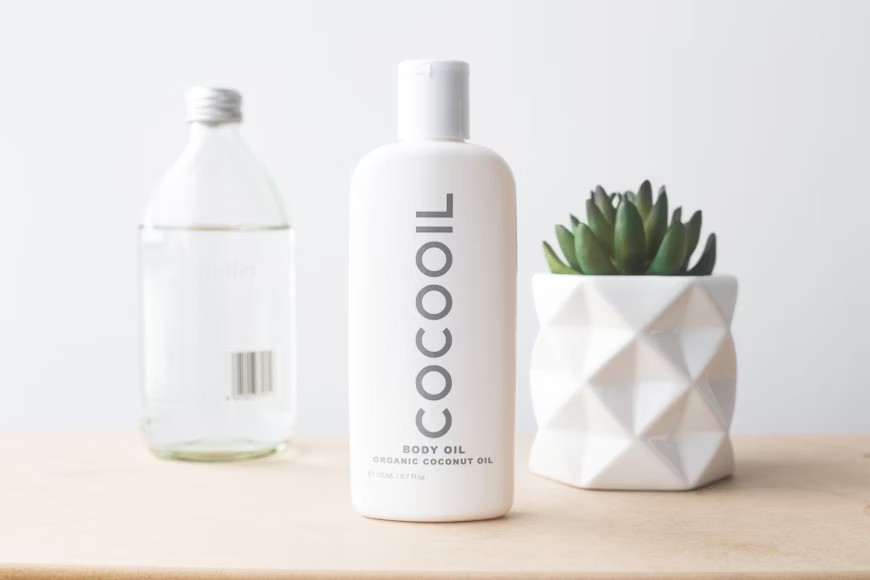
2. White/Silver
What do you feel when you see the color white? Purity, instant relaxation, simplicity, and positivity, right? Well, that is exactly how the white color makes the viewers feel. Similarly, silver is the color of elegance.
Therefore, white or silver color is used by cosmetic brands if they want to be known for the purity, simplicity, and harmlessness of their products.
3. Red/Orange
While neutral shades like black and white are elegant, you might want diversity in your product packaging designs. In such cases, the radiant red and optimistic orange come into play.
Red is the color of passion that can trigger all your senses while orange offers a cheerful energy. For red and orange, playing with different shades is the key to creating attractive beauty packaging.
4. Green/Teal
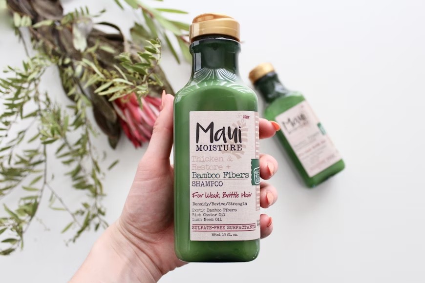
Green and teal are associated with natural goods that represent growth and rejuvenation. The shades on one side of the spectrum of these colors are fresh, bright, and new while on the other side has a calming effect.
Thus, these colors grace the cosmetics that are manufactured either by using all-natural ingredients and are organic, or by eco-friendly brands as it gives a message of saving the earth.
5. Yellow/Gold
Yellow gives buoyant vibes and reflects the energy of the sun while golden is the color of luxury. When used in beauty packaging, the yellow color is related to creativity and innovation.
Popular among young adults, it is used to package products that boost confidence. On the other hand, golden is mainly used to add details to cosmetic packaging design.
6. Blue/Turquoise
What do you feel when you look at the sky or the ocean? A sense of calm, relaxation, and serenity. Colors like blue and turquoise in custom cosmetics packaging make the consumers feel the same.
They have an irresistible charm which makes them one of the top choices to be used as the base colors of beauty packaging.
7. Pink/Purple
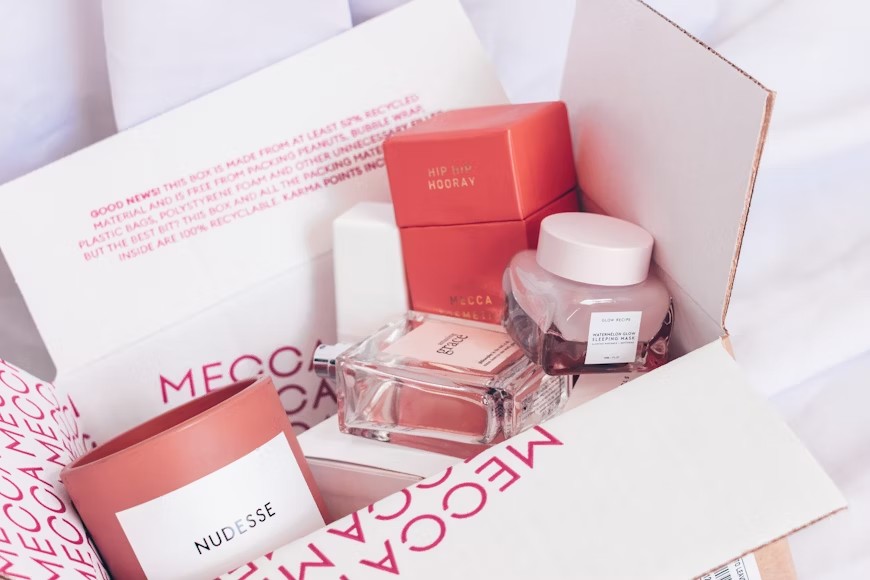
When you want to experiment with some unusual colors, pink and purple can be the ones. Different shades of pink have already been used in manufacturing feminine-only cosmetic packaging.
Similarly, purple is the color used by beauty brands to pack exclusive and limited-edition products.
8. Brown/Beige
Brown is the color of the earth like green is the color of the trees. Thus, it is used to represent eco-friendly products as well and have a calming effect on the minds of the buyers.
Beige is just the lighter shade of brown and has the same role in cosmetic packaging as brown.
Tips for Choosing the Right Colors for Your Cosmetics Brand
Each color we mentioned above looks like a top-notch option, right? However, you can only select one or two colors for your brand. So, here is how you can do so.
1. Analyze Your Target Market
Some colors are more attractive to people in a certain age limit than others. Moreover, the mindset of your target market also plays an important role in determining your color choices.
So, if you have a younger audience, yellow and pink are great while black, white, and golden are more suitable for the older market.
2. Represent the Product Purpose
As you are designing product packaging for different types of cosmetic products like lotion bottles, exfoliating masks, and more, you have to keep in mind the product’s purpose as well.
For example, white color can be used almost for any product, black might be used for products with charcoal in them, green or clay color for clay masks, and yellow for sunscreens.
3. Stick to Core Brand Colors
Each part of your cosmetic packaging including the color palette is a physical image of your brand. Therefore, you have to ensure that the colors you choose go well with your core brand colors.
For example, white is for simple yet elegant brands, black is for high-end brands, and green works well with sustainable brands.
4. Stand Out From the Competition
Every brand uses a set of a few common colors making them all look alike. You need to stand out from the competition for your products to sell well. Thus, whichever color you choose, go for its rare shades and design exclusive packaging that helps your beauty brand stand out.
Conclusion
Color psychology defines the buying decisions of your target audience. Using the right color depends upon the purpose of your product, popular trends in the target market, the core colors of your brand, and the idea behind your brand.
We discussed 8 colors that you can use in your cosmetic packaging to help your brand stand out. Furthermore, contact VCPAK to help you meet all your cosmetic packaging needs from using the right colors to ergonomic designs.