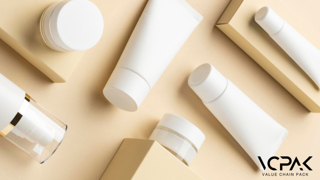
Are you prepared to change cosmetic packaging? We are all aware that beauty is about minimalism. Simplicity is not just a trend in cosmetic packaging design; it is a need in 2024. However, the question that arises is why minimalism is now trending in the cosmetic industry.
When it comes to decision-making and people being overwhelmed by the number of options they are presented, simplicity is noticeable. The sleek packaging is the epitome of simplicity and looks more professional, thus attracting more clients, especially those who appreciate elegance and convection to sustainable packaging. Picture your product in a store — the product is shiny and laconic, minimalistic — it will immediately attract attention and underscore the simplicity of the ingredient inside. Isn’t that the kind of image you would like your brand to portray to society?
That is why, at VCPAK, we have made sure to capture the recent trends while maintaining functionality and appearance. Our simple designs in the packaging of your products will not only make your brand stand out but also appeal to those who want environmentally friendly products.
However, let me first lay down all the important facets that tend to make this specific subject more suitable for the sales-boosting exercise.
The Rise of Minimalist Packaging
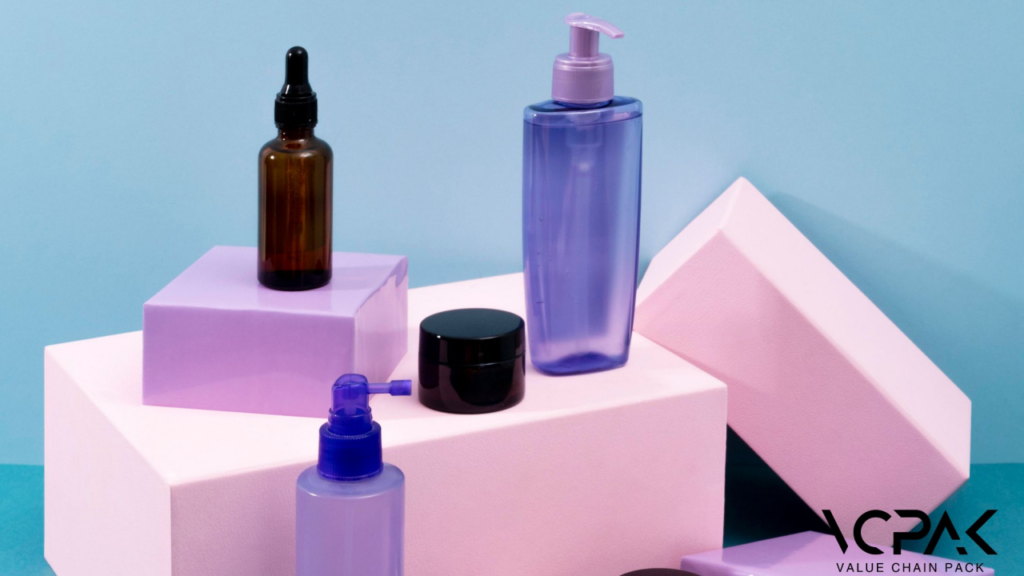
Do you know why some items are immediately recognizable and others to which you barely pay attention? A few years ago, we were working with a client who came to VCPAK with a big problem. Their cosmetic products were good quality but not as famous due to the overly complicated packaging designs. Revenues were stagnating, and the brand was gradually being pushed out of the market arena.
We proposed switching to less packaging as much as possible. The transformation was remarkable. We had to redesign their packaging and make it simple and elegant. We utilized simple fonts and environmentally friendly material to freshen up their brand image and increase their sales. A few smooth and clear lines reflected the high quality of the product and the company’s dedication to environmentally friendly practices.
Packaging design has not remained stagnant but has undergone certain transformations in recent decades. Earlier, using complicated patterns and more vivid ornaments and graphic elements was the tradition, as people strived for visibility in a plethora of similar products. However, due to changes in consumer tendencies that appeared to appreciate the simplicity and eco-friendliness of packaging, minimalism has become relevant.
Why Minimalism Appeals Today
Why is minimalism so appealing in today’s market? The answer lies in the clutter-free and sophisticated aesthetic it provides. In an era where consumers are overwhelmed with choices, minimalist designs offer a breath of fresh air.
They strip away the unnecessary, leaving only the essentials, which resonate deeply with modern buyers who value transparency and environmental consciousness.
Key Principles of Minimalist Packaging Design
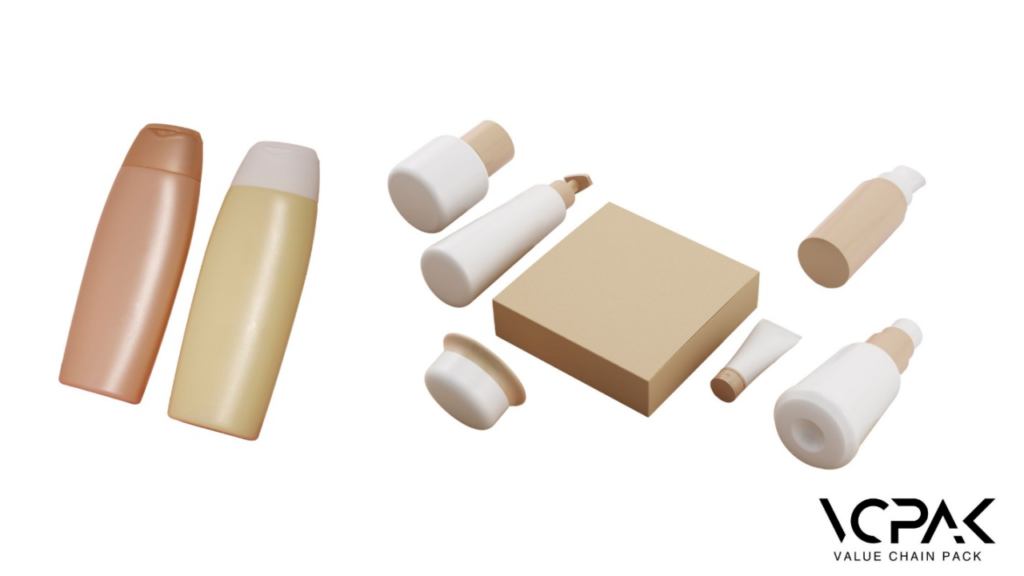
Economical packaging has become a popular phenomenon that mesmerizes buyers and makes brands unique in the constantly evolving environment. However, what are the major guidelines that characterize this approach as the most efficient one? It would be best if you first analyzed the foundational ideas of minimalist packaging and understood how they can help you change your product packaging.
- Simplicity: Minimalism refers to designs that are simplified as far as possible while still being effective. Have you ever been frustrated with packaging that tries to tell the consumer too much? Simplicity thwarts this racket, bringing about clarity and much-cherished aesthetic value. Minimalist design in packaging is, therefore, characterized by simplicity and the elimination of any unimportant features that may not be of any significant value.
- Functionality: Minimalist packaging means that every detail of the packaging has a specific function, ranging from the material used in the packaging to the location of the text. This balance helps to avoid situations when the packaging looks great visually but is not convenient to use in practice. For example, attractive packaging might highlight use-related features such as easy-opening lids or recloseable tops to improve the client experience. This practicality applies to aspects like transportation and storage. At the same time, minimalist designs may look less effective, but they are usually more functional and cheaper.
- Sustainability: What are the ways through which you can ensure that your packaging is perceived in a positive light? It is a well-known fact that sustainability is the basis of minimalist design, which corresponds to the recent trend of environmentally conscious consumers’ attitudes. Since recyclable, biodegradable, or compostable materials are often used in minimalist packaging, the product positively affects the environment. This strategy not only helps save costs but also creates a positive image among consumers who are very sensitive about the environment.
Benefits of Minimalist Packaging for Brands
Minimalist packaging design is transforming the branding landscape, offering significant advantages to businesses.
| Benefit | Description |
| Enhancing Brand Perception | Minimalist packaging provides a clean, modern, and premium appeal. It allows your brand to stand out with elegance and sophistication, creating a lasting impression on consumers. Brands like Apple and Glossier have successfully utilized minimalist design to enhance their brand recognition and appeal. |
| Cost-Effectiveness | By reducing the amount of material and simplifying production processes, minimalist packaging can significantly lower costs. This not only saves money on materials but also on shipping, as lighter and less bulky packaging is cheaper to transport. |
| Improved User Experience | Minimalist packaging often results in more user-friendly designs that are easier to open, use, and dispose of. This improved usability enhances the consumer experience, leading to greater satisfaction and brand loyalty. Simplicity in design helps consumers quickly understand and use the product without being overwhelmed. |
Best Practices for Designing Minimalist Packaging

Here are some tips to ensure that the packaging you create is simple yet attractive and stands out in the market.
1. Color Palettes:
One has to understand that working with shades and stoke and avoiding bright and contrasting colors can really be effective. Tiffany’s, for instance, is easily identifiable with a shade of teal blue, while Anksia, on the other hand, employs the color white to represent purity and luxury. This is especially important because choosing a small set of colors makes the packaging look neat and professional and prevents it from being too flashy.
2. Typography:
Typography is particularly important in minimalist design, as typefaces and fonts are the primary components of the design. Choose clear and easy-to-read fonts to help further communicate your message. They should not be fancy, decorated, or have many curves and lines; rather, they should be in block styles. For example, companies like Glossier do not employ complex fonts and prefer a simplistic typographic approach for their brand to look as sleek and minimalistic as possible. This makes it easy to read the text and is consistent with the theme of modernism.
3.Graphics:
From the minimalist packaging design above, it is advisable to keep the packaging design manageable. Limit the use of graphics, and if you choose to use them, make the graphics stand out. This may be your brand or a symbol that you want to identify your brand with. More so, Six Realms focuses on its logo, where gold foil stamping is added to a simple design, making it stand out.
4. Packaging Materials:
Environmental impacts and, specifically, sustainability are the core of minimalist packaging. Packaging made from craft paper or plastics that can easily be recycled can be used, helping minimize the effects of the packaging on the environment and making the packaging more attractive. Coface noted that it was important for brands like Chezza to continue using Kraft boxes with simple prints that are 100% recyclable to reflect the company’s green credentials. This not only helps to minimize waste but also appeals to the environmental consciousness of clientele.
The Impact: How Minimalism Influences Buying Decisions
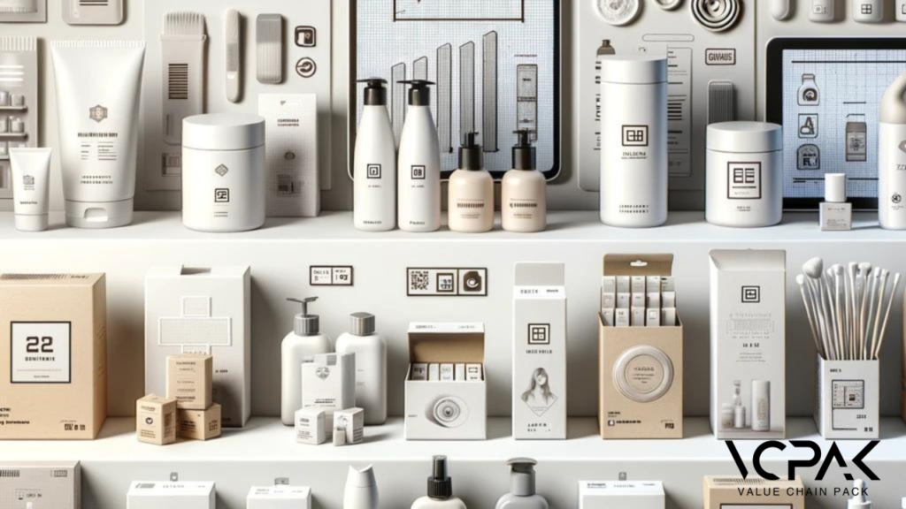
Psychological Appeal: Picture yourself being surrounded by the countless shelves filled with appealing and shiny product wrapping. Now imagine that among all these products, there is an object that has no unnecessary elements and looks minimalistic. Which one of them do you find more appealing? For most consumers, though, the choice will be limited to the package on the extreme right. This is no coincidence. It is in harmony with the way people’s mind works, as the idea of stripping off any unnecessary elements and leaving them simple and uncluttered has a calming effect. It helps consumers gain insight about the product within the shortest time possible without having to go through lots of details, thus making the consumers more comfortable and confident while making their decisions.
This perception of value goes a long way in changing the behavior of an individual into preferring products that are packaged with minimal prints compared to those that are packaged with so many prints.
The Impact: Increasing Demand for Minimalist Products in 2024
From 2024 onwards, we can safely conclude that the focus on minimalistic packaging will increase. The public is becoming wiser about their product choices and is going green in their choice of commodities. This shift is forcing many brands to design their products with as few materials as possible and to promote sustainable strategies.
This is also driven by the need for products with modern, elegant, and simple packaging that reflects the lifestyle of health-conscious and fashionable consumers. With information and choices pervading every aspect of our lives, minimalistic packaging is a breath of fresh air and a return to basics that are elegant and efficient in their simplicity.
Trends to Watch in Minimalist Packaging for 2024
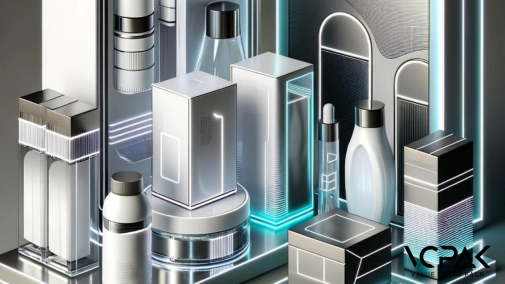
What’s Next in Minimalist Packaging:
In 2024, expect to see a more robust emphasis on neutral color palettes and clean, simple designs that convey elegance and high quality. This trend is evident in brands like The Ordinary, which utilizes white or transparent packaging with clear, readable black text to highlight product quality and transparency.
Innovative Materials:
Sustainability remains a key focus in packaging innovations for 2024. Brands are increasingly turning to biodegradable, recyclable, and compostable materials to meet consumer demands for eco-friendly products. An excellent example is the Como Beauty Stick by Libo Cosmetics, made from 100% recyclable aluminum, which significantly reduces carbon emissions.
Technological Advancements:
Technological improvements are playing a crucial role in the evolution of minimalist packaging. The integration of smart packaging technologies like QR codes, NFC tags, and augmented reality (AR) is becoming more prevalent. These innovations enhance the consumer experience by providing detailed product information, tutorials, and virtual try-on experiences right from the packaging. For instance, Clinique has started using NFC technology in its packaging, allowing consumers to access detailed product information with a simple tap of their smartphone.
Getting Started with Minimalist Packaging at VCPAK
Imagine launching a new cosmetic line with packaging that not only stands out on the frames but also resonates deeply with your brand’s ethos. What if you could achieve this with the help of experts who understand the nuances of minimalist design and the importance of sustainability? At VCPAK, we make this vision a reality.
But have you ever felt overwhelmed by the sheer complexity of designing effective packaging? Our team at VCPak is also here to alleviate that stress. We work closely with you to understand your brand’s unique needs and goals. By integrating your vision with our expertise, we create packaging solutions that are both aesthetically pleasing and functionally superior. This partnership guarantees that your packaging not only looks great but also aligns perfectly with your brand identity.
So, why go for less when you can have the best? Customization is at the heart of what we do. Whether you need custom colors, logos, or finishes, VCPAK offers a wide range of personalization options to make your packaging truly unique.
Ready to make a change? Fill out the simple form below to request your free quote now.

