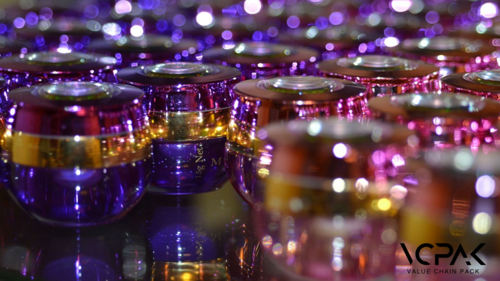
Cosmetics have become quite the obsession in this generation, and one cannot underestimate the value of making that first great impression.
Firstly, think of your product being placed in what appears to be a large basket of products, all competing for the consumer’s attention.
Here’s what you need to ask yourself: Why should customers choose your product? The answer is in the possibilities of packaging design.
However, we have to focus on this important factor, which involves analyzing new tendencies in artistic and aesthetically beautiful packaging designs.
We will uncover these eye-popping trends and show how they can grab the attention of consumers while enhancing the shelf appeal of your product.
Do you also think about the company that can do this amazing design? Don’t because we know that packaging is not only a protective layer around a product but also a communication platform.
Well, now let’s examine those designs that make you pause and contemplate and learn how to incorporate them into your strategy.
The Importance of Packaging Design in the Cosmetic Industry
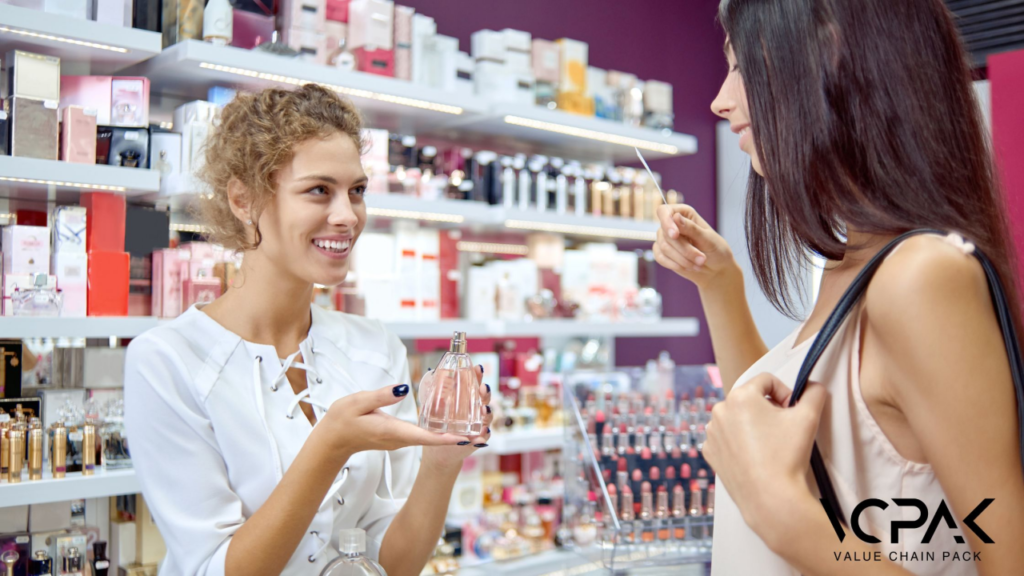
Of course, packaging design is much, much more than simply a container for your products; it is, in fact, an essential element that determines the fate of your brand.
Have you ever strolled down an aisle at the supermarket and suddenly your attention is being pulled in the direction of some item?
That is the beauty of packaging and that is why packaging design is so important. Since there is competition from all sides, having well-designed packaging helps to get the consumer’s attention and make the first step towards purchasing your product.
This first impression can go a long way towards dictating whether or not consumers will continue to engage with a product, meaning that packaging is a worthwhile area to spend money on to make it as visually appealing and intelligently designed as possible.
Consumer Psychology and Visual Appeal
Research by Kotler and others reveals that a consumer forms a first impression of a product within twenty-five seconds of observing it. How can a product stand out? A colorful pack design has shapes and cuts that are different from conventional pack designs.
The material used is appealing to the eye and elicits an emotional response. Consumers will be more likely to pick up your product instead of the other products available in the market.
Crowded Marketplace Dynamics
Today, when every new product is introduced with a few tweaks from the previous model, the aesthetics of the product is a key factor that makes the product stand out in the market.
Due to the increasing number of brands, one may need help paying attention to their brand; therefore, through attractive packaging, the brand will stand out, and people will be encouraged to keep on coming back for more.
Sophisticated and stunning appearance not only attracts the public attention but also sends out the message of quality and rarity.
Brand Identity and Storytelling
Your packaging is your logo—the moment someone sees your box, he already knows what kind of company you represent. Whether it is a minimalist design that gives the impression of purity and elegance or bright colors that symbolize creativity and enjoyment, your design selection communicates a message about your company.
Interactive and Engaging Elements
In the modern world, packaging design trends incorporate technology such as QR codes and Augmented Reality. These elements may offer consumers more product details, guides, and even fitting trials, all of which can create an extra layer of interaction that may greatly impact consumers’ buying behaviors.
Current Trends in Cosmetic Packaging Design
Let’s examine the current trends that are shaping the future of cosmetic packaging design.
- Minimalism and Elegance
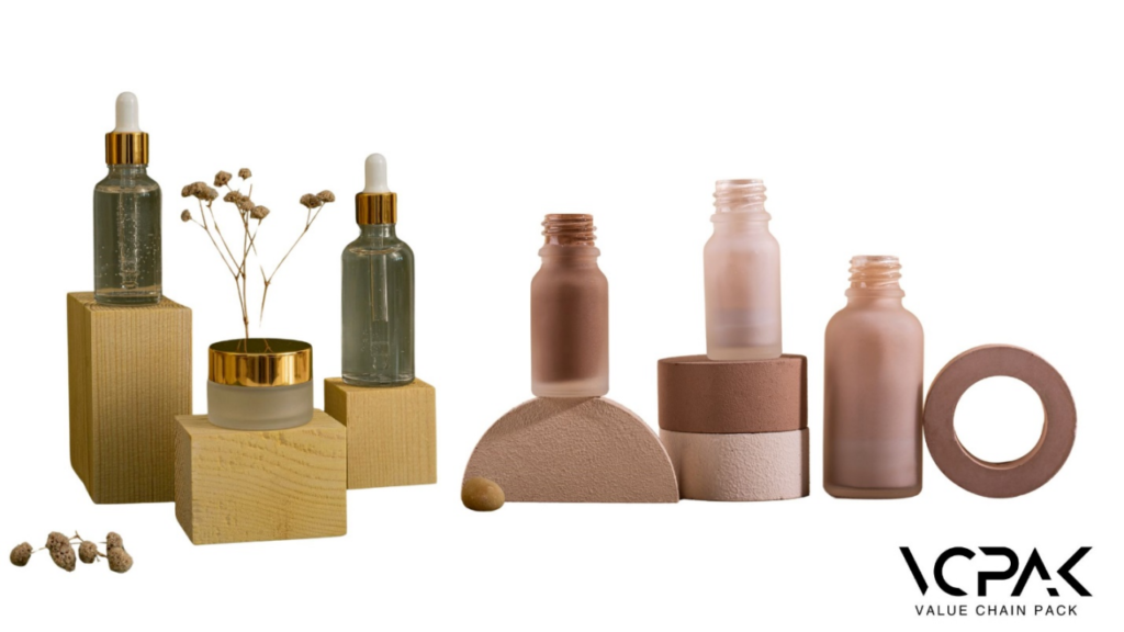
Less is more. This adage perfectly captures the minimalist trend sweeping the cosmetic packaging industry. Clean lines, subtle elegance, and a focus on essential elements characterize minimalist packaging. Brands are moving away from cluttered designs and instead embracing simplicity to convey transparency and honesty.
The Ordinary, a skincare brand known for its no-frills approach, can be a good example. It uses simple dropper bottles with minimal text.
- Bold and Vibrant Colours
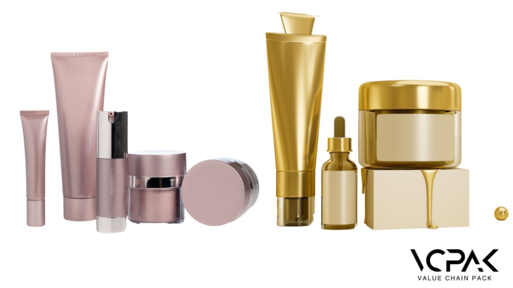
In contrast to the minimalist trend, bold and vibrant colors are also making waves in the cosmetic packaging world. These colors are used to create a striking visual impact, attract attention, and evoke specific emotions. The strategic use of color can significantly influence consumer perception and purchasing decisions.
The use of vibrant colors, such as hot pinks, deep purples, and metallics, makes products stand out on the shelves.
- Eco-Friendly Materials
Sustainability is no longer just a buzzword; it’s a necessity. As consumers become increasingly eco-conscious, brands are adopting sustainable packaging solutions to reduce their environmental footprint. This trend includes using recyclable, biodegradable, and refillable materials.
Recycled plastics, biodegradable materials like cornstarch and sugarcane, and refillable containers are common eco-friendly materials in cosmetic packaging.
- Innovation and Technology
Advancements in technology are revolutionizing cosmetic packaging. Smart packaging solutions such as QR codes, NFC technology, and augmented reality are being integrated to enhance the consumer experience. These technologies provide additional product information, interactive tutorials, and even virtual try-on experiences.
- Target Audience and Inclusivity
Understanding the target audience and promoting inclusivity are becoming essential aspects of cosmetic packaging design. Brands are creating gender-neutral and accessible packaging to cater to a diverse consumer base.
Brands like Aesop and ASARAI use simple, non-gendered designs that appeal to a wide audience. This approach not only broadens the brand’s appeal but also reflects a commitment to inclusivity and diversity.
Artistic Elements to Enhance Packaging
Did you know that packaging design is one of the ways through which people express their creativity? It has a huge impact on consumer behavior and brand reputation. Now, let’s discuss the main areas that, if treated practically, will make the packaging exclusive and create a beautiful story for the client.
1. Creative Typography:
Typography is not only the text on your packaging but also a significant design asset that helps customers understand your brand’s character and principles. It is impossible to deny that non-standard and creative fonts can turn simple packaging into a piece of art.
Consider the packing design with such beautiful handwriting as if it is scribbled to give the product a luxurious and classical look or a rough font that would depict the energetic look of a modern makeup line. This is why you should avoid fancy, hard-to-read fonts that do not match your brand’s identity as a no-nonsense skincare company.
2. Illustrations and Graphics:
Illustrations can be used to narrate a specific story, to stir emotion, or to associate with the target audience. They give a chance to vent to themselves, to show who they are and what they are, and to reflect their product in the best possible way.
Pat McGrath Labs is famous for its eye-catching product packaging design. Their products mostly have complicated designs, great illustrations, and great graphics, which makes the packaging look more like artwork.
3. Texture and Finish:
The use of different textures and finishes not only enhances the sensory feel of the product but also makes it more attractive.
Another level of packaging appeal, which refers to the haptic sense, involves the use of textures such as matte, gloss, and embossing. A matte surface looks classy and discreet, whereas a high-gloss surface resembles more contemporary styles. This technique has the potential to enhance the appeal and interest of the packaging and give it a luxury look and feel.
For instance, a dull texture with shiny highlights or raised logos gives a contrasting appearance that is compelling and encourages the buyer to engage their senses with the packaging.
Brands with Exceptional Packaging Designs
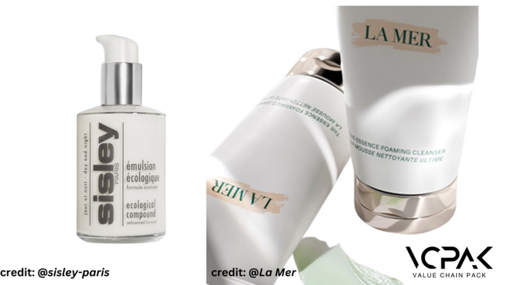
In the highly competitive realm of luxury skincare, several brands faced a crisis. Their products, despite being scientifically advanced and highly effective, needed help to capture the market’s attention. Brands like:
Today, La Mer – or the ‘Miracle Broth’ – is a White Road staple. Still, its journey to becoming one of the biggest luxury skincare brands was not an easy one. Years back, as the brand sought to expand its reach, it faced a significant challenge: how to convey to the viewer at first sight that the products available in the store are of the highest quality and provide the best results. The real highlight was the new Miracle Broth, which featured lovely jars and beautifully designed bottles. The product packaging was simple but elegant, with frosted glass and a clean design that clearly signaled pristine and upscale. Apart from improving the image of the brand, this design choice was quite successful in the market as it appealed to the consumers and became a popular selling point.
Luxury skincare brand Sisley-Paris was another success story in the packaging that communicated the sophistication of French beauty and the luxuriousness of botanical ingredients. Some time ago, when the brand faced a difficult period, it decided to update the packaging and make it reflect the exquisiteness and scarcity of the ingredients used in the product like Black Baccara rose and saffron. The changes in packaging design also reflected a distinct art-deco style, and the luxurious material used in the new packs further stood out on the shelves. This strategic move helped Sisley-Paris to regain its market position and, at the same time, strengthened its brand image as a luxury brand.
Well, what is the magic formula for these brands? It is the way they have been able to incorporate the art of storytelling and sophistication in their packaging designs while still focusing on the functionality of packaging. This guarantees that the packaging is not only a means of protecting the product but also a means of creating a brand image and a positive association in the minds of the consumers.
If these brands can achieve such remarkable success through innovative packaging, so can you. By focusing on creative, high-quality packaging that tells your brand’s story, you can elevate your products and captivate your audience. Request for our free quote today to get started.
How VCPAK Can Help You Achieve Trendy Packaging Designs
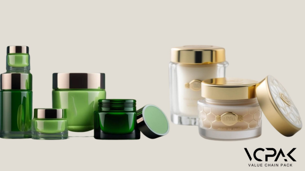
We start by asking the right questions. What message do you want your packaging to convey? Who is your target audience? What are your brand’s core values? By answering these questions, we ensure that every design element—from color schemes to typography and graphics—aligns perfectly with your brand’s narrative. For instance, if your brand emphasizes sustainability, we’ll incorporate eco-friendly materials and designs that reflect your commitment to the environment.
In VCPAK, the packaging approach is as critical as the methodology applied in the packaging process. To maintain the cutting edge, we incorporate the latest materials that not only have an appealing aesthetic but also enhanced utility and durability. Some of our packaging solutions can include environmentally friendly plastics such as biodegradable plastics and plastics made from recycled materials, among others, besides incorporating special finishes to the products that add a touch-and-feel factor.
Our clients have witnessed a positive change by embracing the right packaging strategy. The advantages are obvious, from improved visualization to heightened brand awareness and customer loyalty. Companies that have associated themselves with VCPAK have been able to create a slot for themselves in the market, which has resulted in increased demand for their products and improved customer loyalty. Therefore, keep your products from disappearing into the background, unnoticed and unappreciated. Please fill out the form below for a free quote and remark on the exceptional work done here.

